Overview
When a luxury beauty company asks you to rescue a half‑built app, you learn fast that polish is only half the job. We stepped in to redesign three mission‑critical flows (face scanning, tutorials, and a precision brow builder) inside a moving train of firmware updates and tight deadlines. Here is how product design turned a shaky prototype into a usable, brand‑ready experience.
The challenge
The visuals looked polished but did not fully align. Spacing and components drifted across screens, so the product didn't feel consistent. The scan flow was friendly but its cues left room for doubt. The tutorial ran longer than ideal and did not always match the device prompts. The brow builder worked yet felt cramped on smaller phones, which made fine control harder than it needed to be.
How we worked
We ran weekly sprints. Each week ended with a tested build and a short changelog. That rhythm kept feedback focused and decisions clear. Design refined flows and prepared the next round of screens while engineering shipped updates. Scope stayed steady until the key demo.
Scanning: steady guidance that builds trust
Scanning is the front door. We kept the overall steps and rebuilt the guidance to feel purposeful and on brand. The circular mask became a soft-glow oval that fits real faces. A thin golden stroke brightens as the face moves into position and turns solid at the right moment. Short arrow cues and a three-second countdown make left and right turns easy to follow. Status messages live near the camera view so attention stays on the lens. A tiny delay in feedback prevents jitter while the phone settles. The flow feels calm and predictable instead of delicate.
insert-video-one
Tutorial: short, clear, consistent
The tutorial teaches motion and sets expectations. We trimmed the sequence to land under two minutes. Copy now matches the device prompts word for word. The same idea appears in the same place on both screens. People no longer juggle conflicting guidance and can reach a first print with less effort.
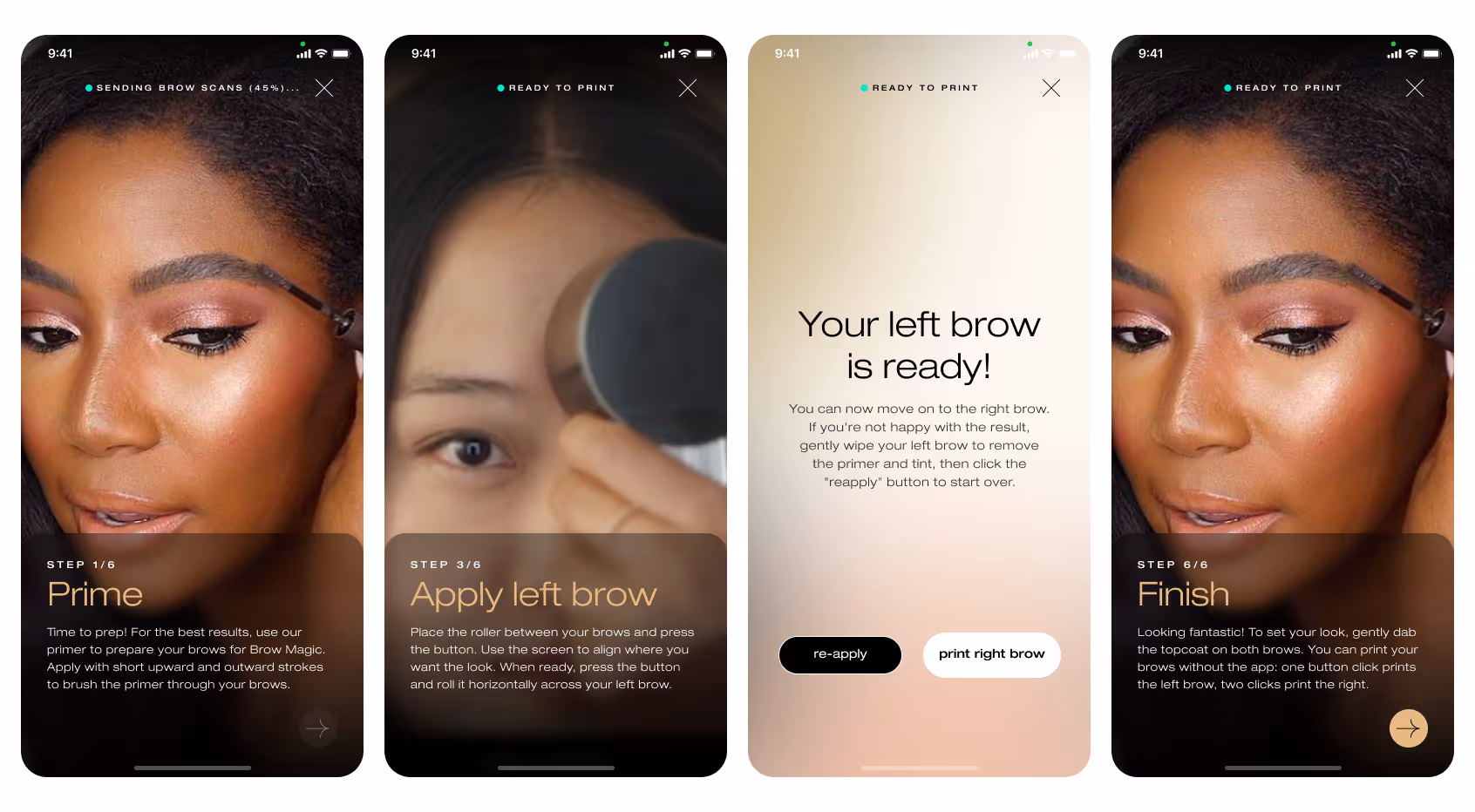
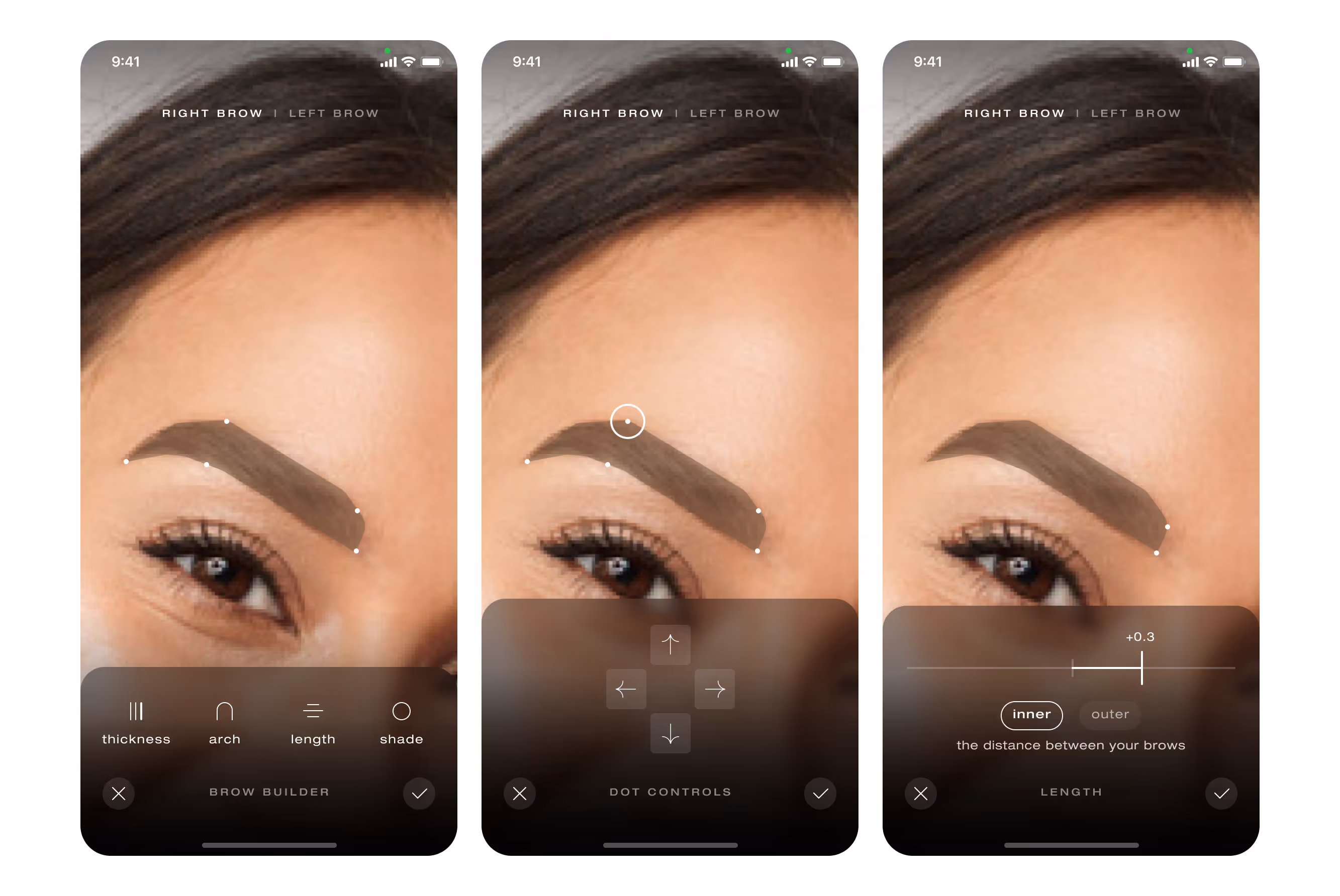
Brow builder: precision on a small canvas
We shifted from a single narrow slider to draggable anchor points with arrow nudges. Tap, nudge, watch the brow move in small steps without a finger blocking the view. The preview changed from a wireframe outline to a filled shape in the intended color. Seeing the result as it will print builds confidence before any ink touches skin.
System and accessibility
Type scales, color tokens, and motion now read as one system. We verified contrast and target sizes against WCAG AA. Most haptics were removed to avoid camera shake during scanning, and a single confirmation vibration remains where it actually helps. Voice prompts were explored, then parked for later and will be reconsidered when budget permits.
Results
Scanning now runs on a single visual language. The glow ring, arrow cues, and countdown work together, and early tests show faster “face positioned correctly” confirmations with fewer restarts. The tutorial plays in under two minutes and mirrors the device prompts, which reduced first-session confusion in qualitative sessions. The brow editor supports fine adjustments with fewer mis-taps. The interface reads as one product rather than a set of separate screens.
Takeaway
Speed, clarity, and craft matter in equal measure. By removing guesswork and aligning every instruction across app and device, the product moved from promising to dependable. The backbone is now in place. Future sprints can add delight without risking stability.