Overview
When Cloudberry, a fast-growing health-tech startup, realized its visual identity no longer matched its ambition, the team turned to Born West to rebuild its brand from the inside out. What began as a simple logo refresh turned into a full design system that shaped everything from product screens to clinic adoption.
The Challenge
Cloudberry began life as an early-stage prototype in digital health. It solved real workflow problems for clinicians but looked like many competitors: cold, clinical, and inconsistent. Investors saw potential, but users struggled to feel trust. The brief was clear. Create a visual identity that felt personal and credible while still being ready to scale with a complex product.
Health-tech design carries pressure that other categories do not. It must meet accessibility standards, pass internal review by clinicians, and signal reliability at first glance. At the same time, Cloudberry wanted warmth and humanity instead of the typical hospital gray. Every choice from color to spacing had to balance empathy with precision.
From Idea to Logo
Phase 1: Research & Harmonize
We began with an internal audit to understand how the team saw their brand. Each member answered ten open questions about personality, tone, and aesthetics. We organized the answers into an affinity map, and identified clear themes for what the team felt they were and were not.
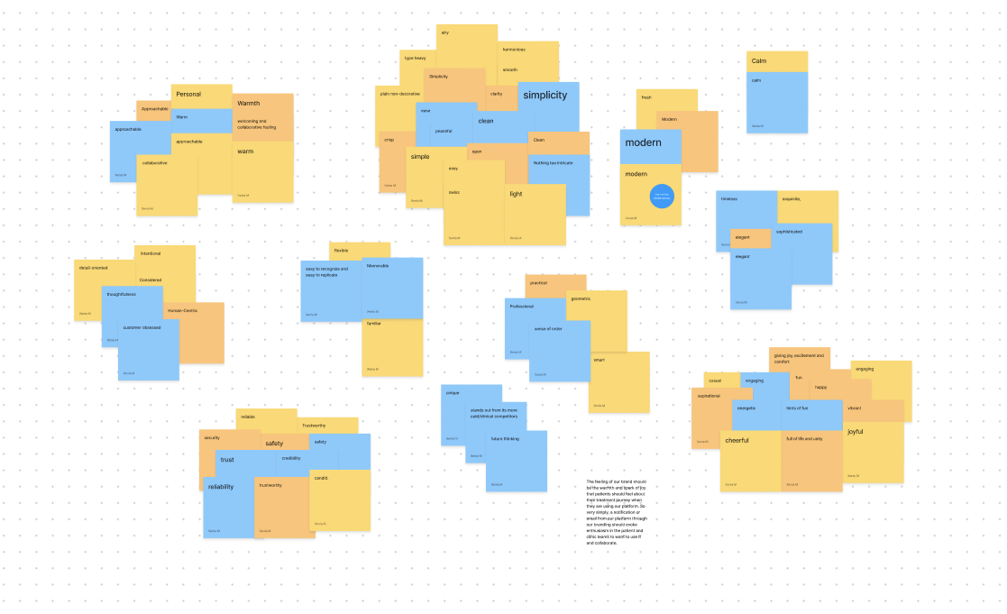
They described themselves as simple, trustworthy, warm, collaborative, joyful, and reliable. They wanted to avoid anything cold, formal, clinical, or trendy.
These themes became the project’s direction.
The Name
The founders chose Cloudberry for personal reasons: everyone liked it, and it sounded human without being whimsical. It bridged nature and technology. The name’s organic feel gave the design team room to build a color system rooted in warmth instead of the sterile palettes common in healthcare software.

Mood and Tone
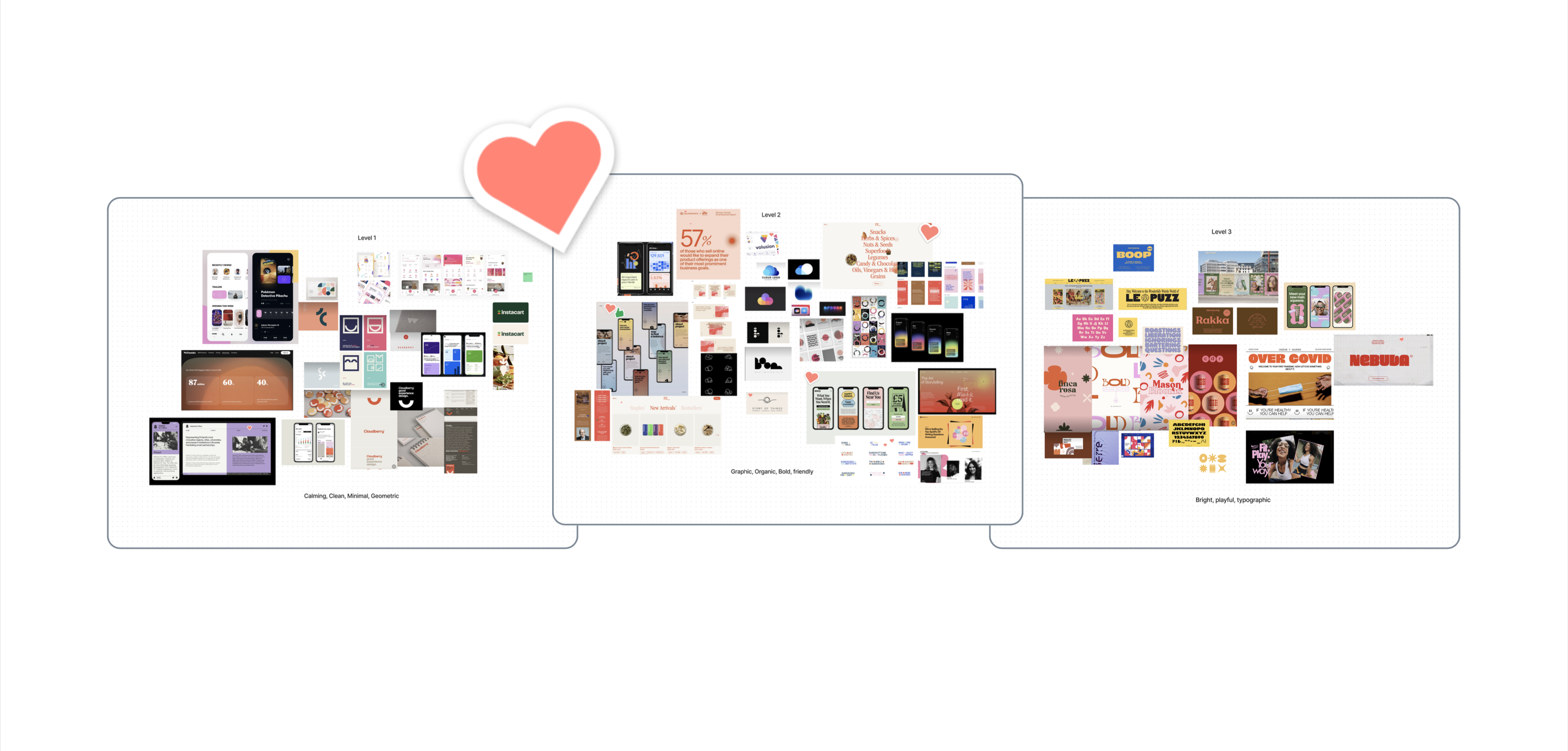
Next came visual research. We explored color and texture drawn from natural warmth such as orange gradients, soft coral hues, and real cloudberries. They created a sense of optimism without feeling playful.
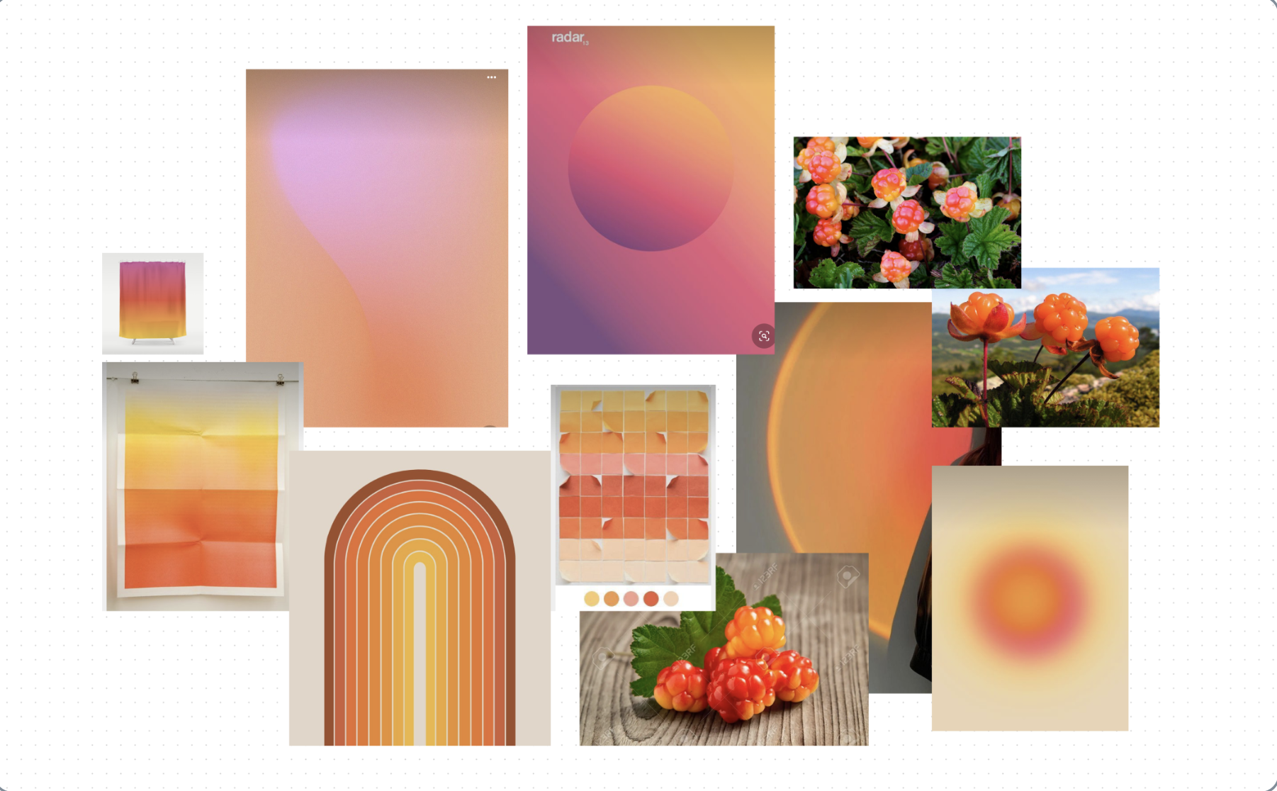
We presented three boards that ranged from minimal and conservative to bold and expressive. This gave the team a spectrum of tone rather than a single track. The team chose the middle board. It was clean but vibrant, and it set the course for our color and typography choices.
Phase 2: Exploration & Development
With the tone established, we generated dozens of logo and wordmark options. The goal was to explore a wide range of shapes and weights before narrowing down. The exploration grid on the image below filled entire Figma artboards with variations in curvature, spacing, and friendliness.
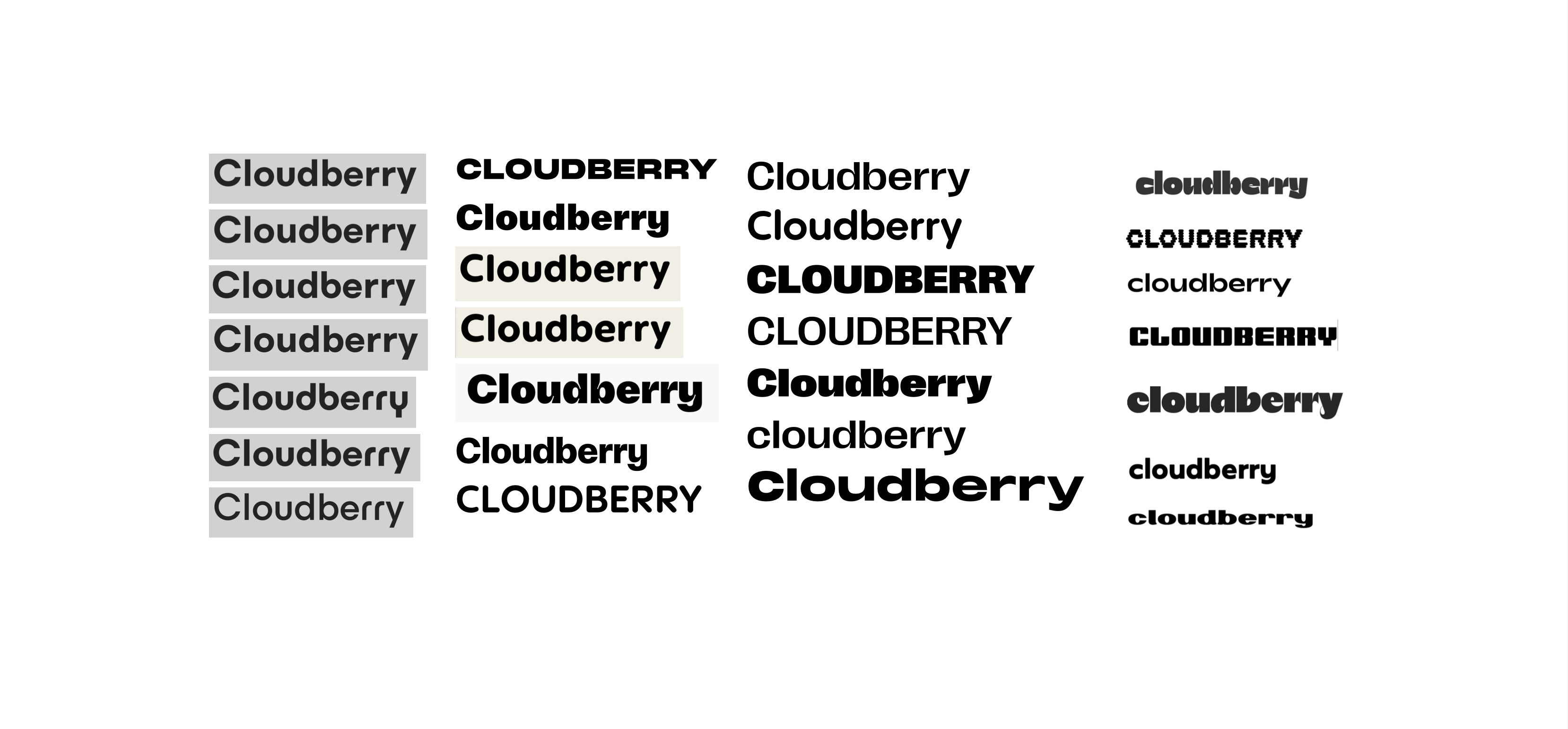
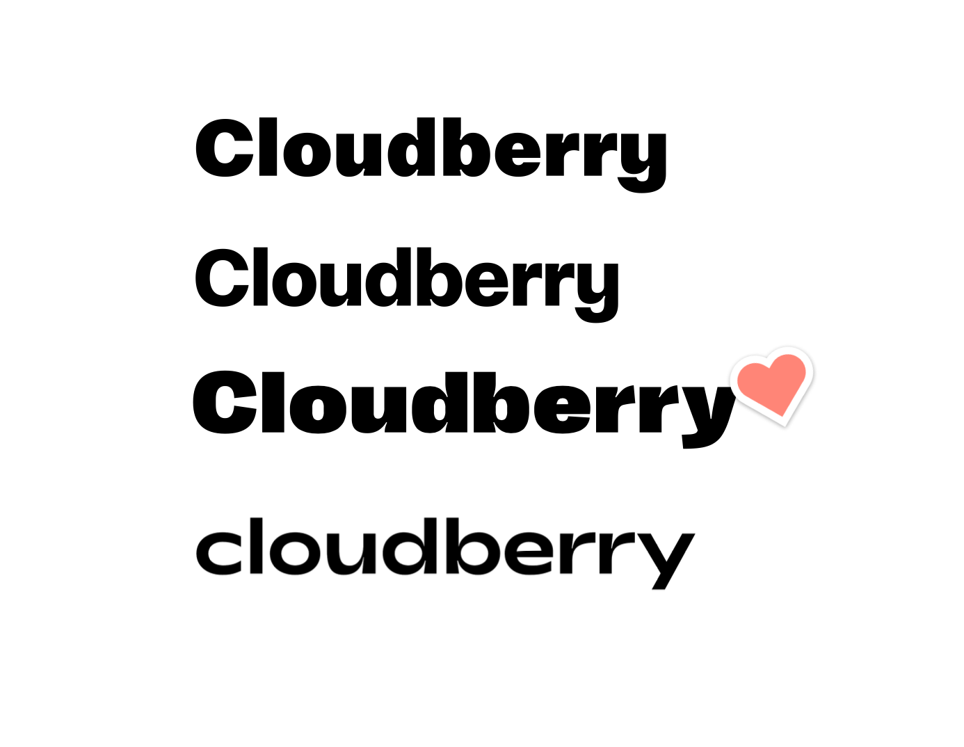
A team vote narrowed the list to four directions. The winning mark used rounded letters with a subtle rhythm in the forms. It felt modern and approachable, and it looked confident beside competitors.
Phase 3: Feedback & Refinement
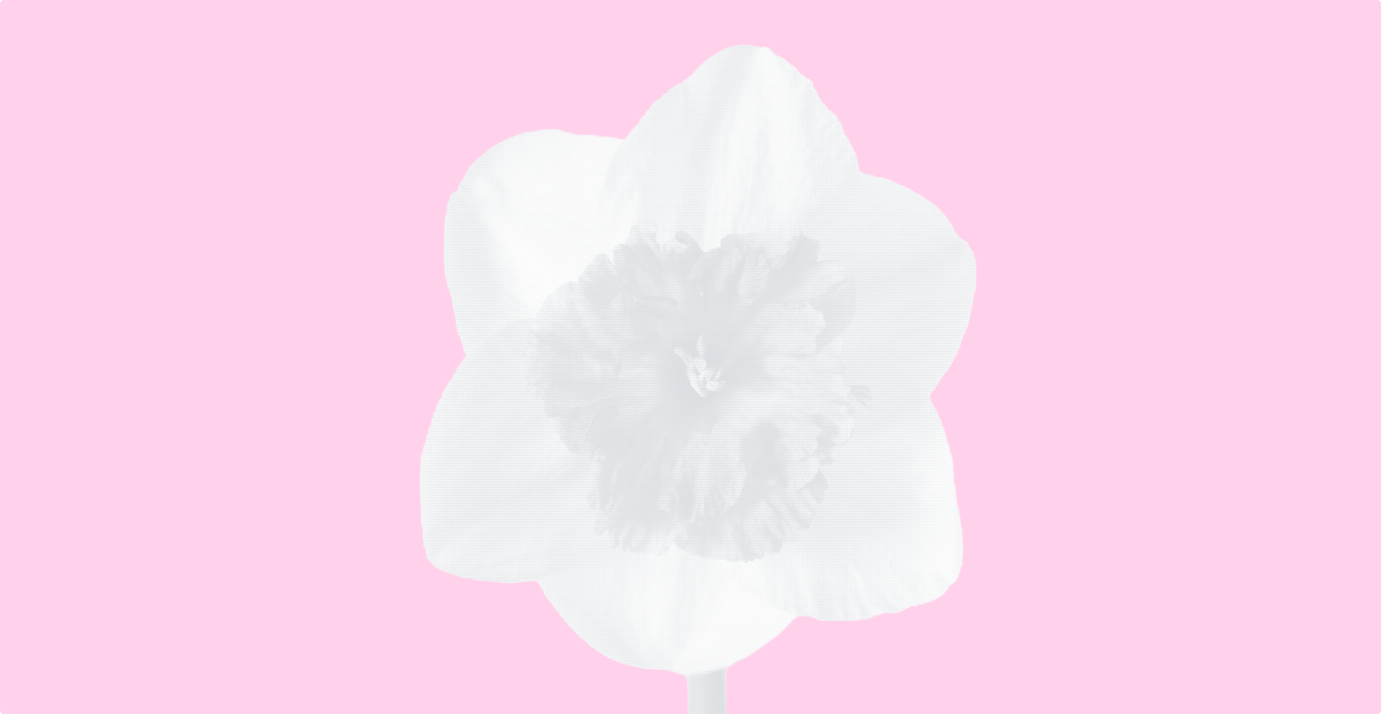
Early feedback pushed us away from literal cloud shapes because they created unwanted associations with cloud-storage products. We refined the direction toward abstract geometry inspired by berry clusters. The boards on the image below show dozens of forms: petals, overlapping circles, and simple dots.
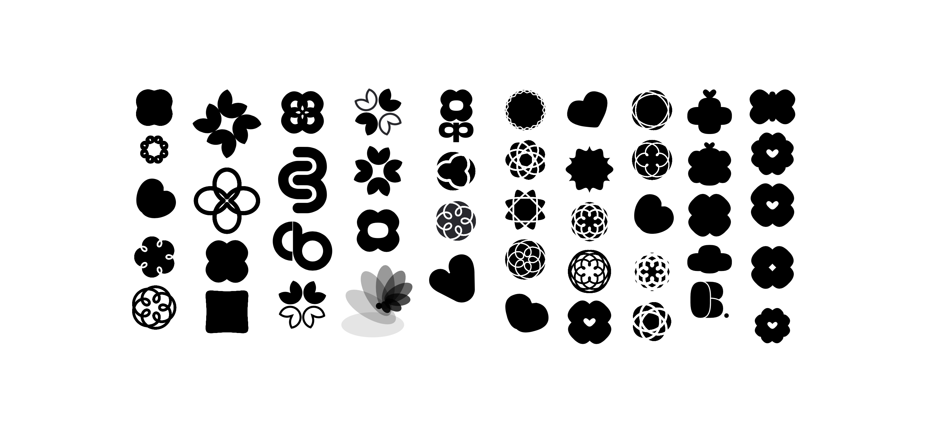
One concept struck the right balance of structure and softness.
We tested icons and colors together to confirm legibility across light and dark modes. Each variant was checked against WCAG 2.1 contrast standards. The final logo scaled well from app icons to large displays without losing clarity.
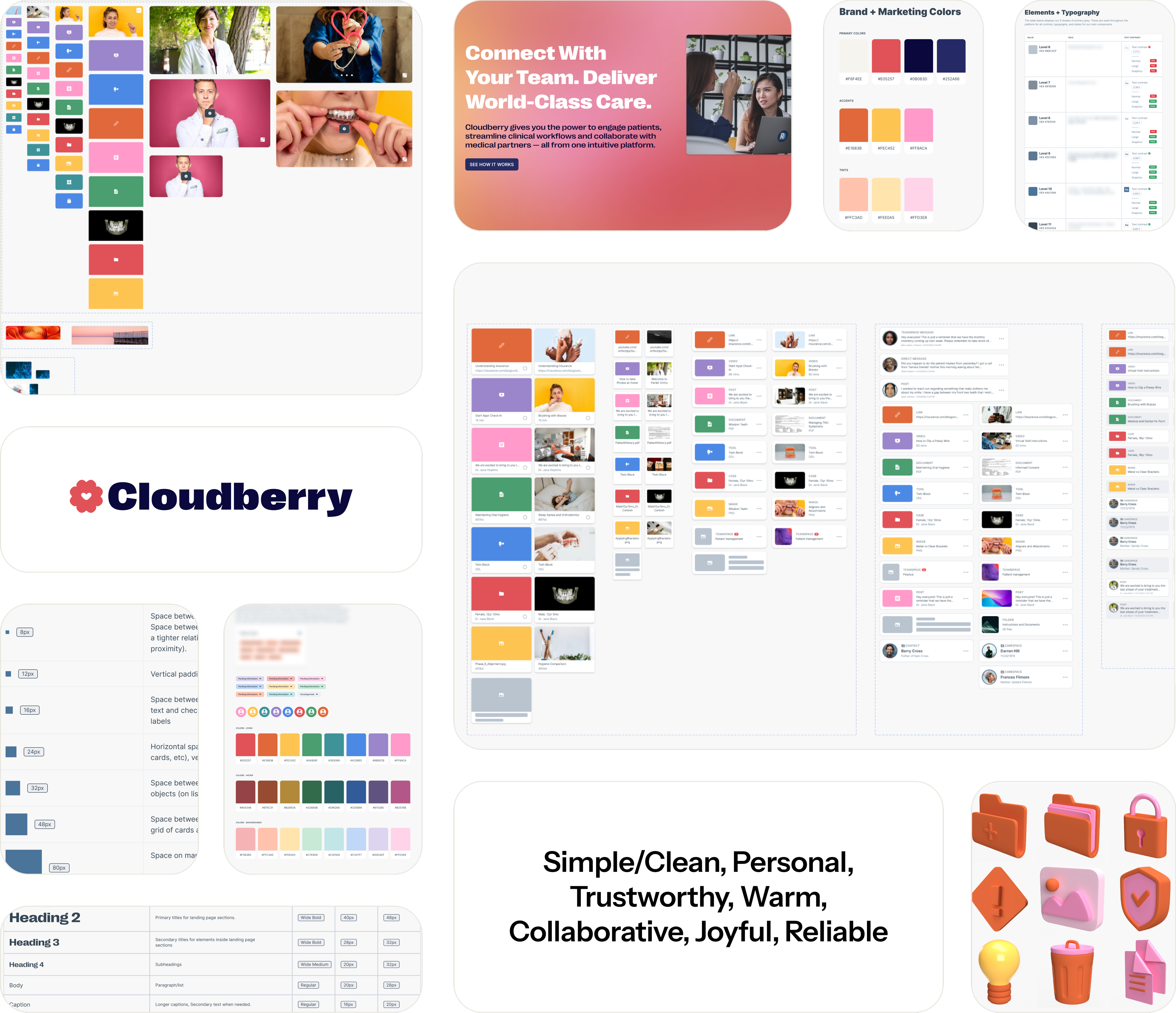
Brand and Design System
Once the identity was finalized, we turned to the system that would make it work everywhere.
Grids and Spacing
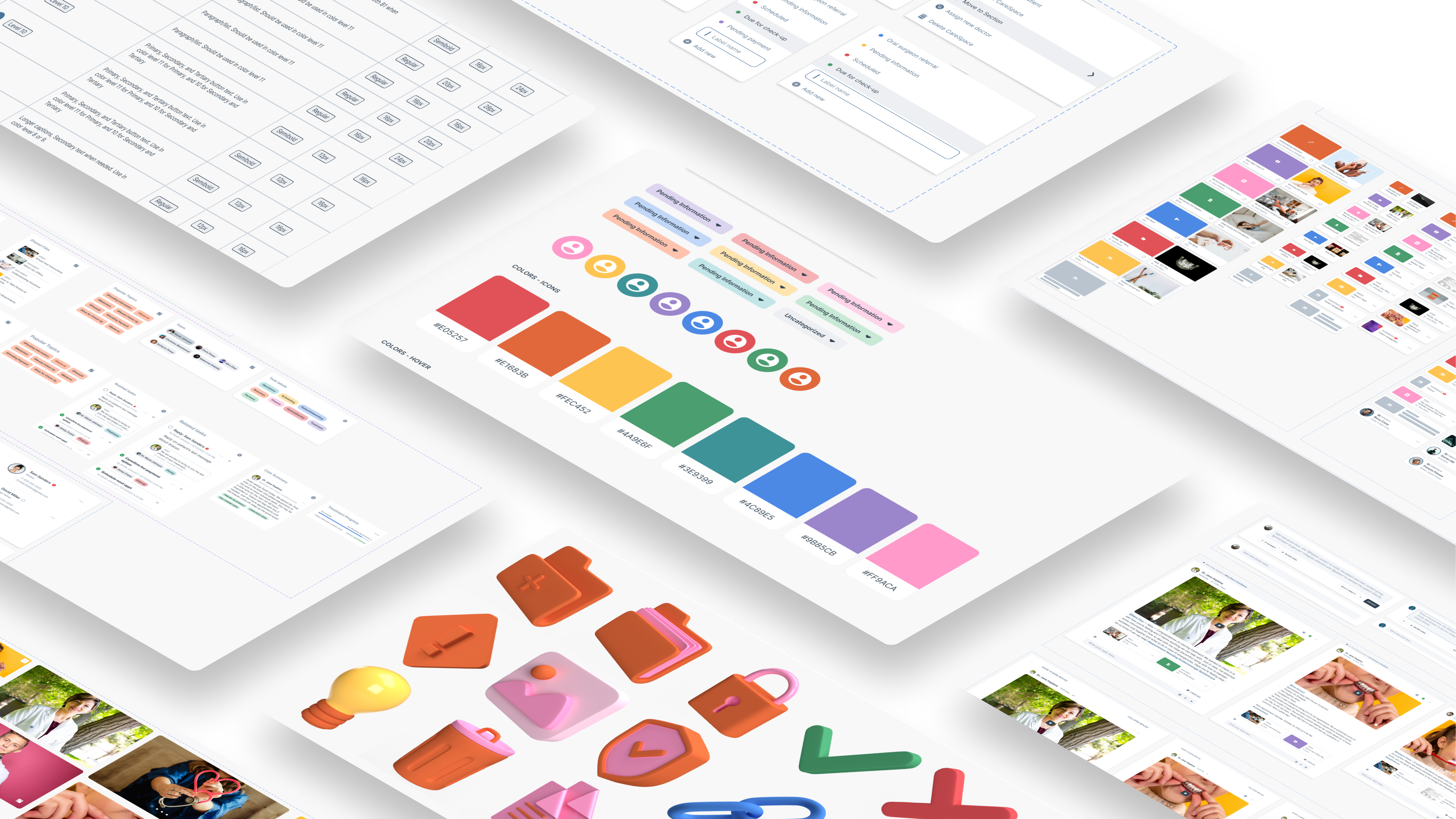
We began with structure: a 12-column grid and an 8-point spacing scale – the invisible scaffolding that keeps screens consistent and flexible. While these decisions sound small, they reduced alignment errors and visual drift as new pages were added.
Color System
Color carried the emotional weight. We replaced harsh grays with navy tones that kept contrast high but felt calmer. The palette included semantic states such as green for success, yellow for warning, and red for errors. We added enough intermediate shades to support future features that did not yet exist. That choice saved time later when new modules rolled in.
Typography
We chose Inter, a neutral and highly readable typeface that performs well across devices. Sentence case remained standard throughout. The rule was clarity first, personality second. The teams use Cloudberry every day, so we needed something that stays comfortable during long sessions and reduces visual fatigue. Inter’s generous spacing and clean shapes help with that. It also tests well in clinical and health tech settings where precision and quick scanning matter. The typeface keeps the interface calm, steady, and predictable, which is exactly what you want when people rely on the tool for important work.
Iconography and Motion
We standardized icon scaling and introduced light gradients for modals and overlays. Rounded corners and soft shadows reinforced the sense of a warm, human interface.
Components and Content
To speed prototyping, we built a component library in Figma with auto layout and variants. Every component used real sample content. No lorem ipsum. This made every screen look realistic during early reviews and reduced prototype build time from days to hours.
Impact at a glance
Design clarity turned into business traction. In October 2022, Cloudberry launched a month-long pilot at a clinic serving 1,500 patients and six clinicians. Adoption metrics showed that design and usability directly improved engagement:
insert-stats
By May 2023, the platform scaled to 10 clinics and 10,000 patients. The design system held up under growth with no visual drift or usability loss.
Internally, the system unified design and engineering. Instead of debating pixel details, teams built new pages in hours. The design framework became a shared language that aligned product, marketing, and operations.
Lessons Learned
The key lesson: plan for scalability early. The color and component systems we built “too big” turned out to be exactly what the product needed months later. Establishing design guardrails from day one prevented chaos as the product expanded.
Another takeaway was accessibility as strategy, not compliance. Treating contrast and readability as creative constraints produced a cleaner, calmer interface that patients trusted instinctively.
The Takeaway
In health tech, trust is the real currency. Cloudberry’s rebrand shows that visual design can build it. What started as a search for a warmer logo ended with a living design system that drives adoption, saves time, and scales with confidence.
Born West’s process—research, exploration, and refinement—turned complexity into clarity. Cloudberry now looks and feels like the product it always aimed to be: reliable, human, and ready to grow.