When a luxury beauty company asks you to rescue a half‑built app, you learn fast that polish is only half the job. We stepped in to redesign three mission‑critical flows (face scanning, tutorials, and a precision brow builder) inside a moving train of firmware updates and tight deadlines. Here is how product design turned a shaky prototype into a usable, brand‑ready experience.
Challenge
The project came with elegant visuals, yet a handful of UX wrinkles showed up during review:
Component styles and spacing varied from screen to screen, so the interface felt almost but not quite cohesive.
The scanning flow was present, but not intuitive enough. Its alignment cues and feedback needed an extra layer of clarity for true first‑try confidence.
The tutorial ran longer than ideal and did not always match the prompts on the printer itself.
The brow builder worked, yet its control layout felt cramped and clunky on smaller phones.
Limited overlap with the previous team meant design intent was not always documented.
The brief was clear: shorten the learning curve, iron out inconsistencies, and do it faster than the hardware team could refresh firmwares.
Key decisions
1. Face-first scanning redesign
Kept the overall step count, but rebuilt the guidance visuals to feel purposeful and on‑brand.
Mapped every user gesture, then reduced alignment checkpoints from twenty to roughly seven by merging nearest neighbours.
Ran more than twenty UI experiments (solid lines, dotted lines, soft glows, muted overlays). The winning combo used a lightly blurred dark layer with a soft‑glow oval that echoes real face proportions. A thin golden stroke brightens as users align, then turns solid when they hit the sweet spot.
Added inline arrow animations for the left‑ and right‑turn moments, plus a three‑second countdown that pulses in place so users know when to freeze.
Introduced a tolerance snap: when the dotted “current” guide sits within a small buffer of the target line, we auto‑confirm instead of forcing pixel‑perfect alignment. Precision feels magical; users stop fighting the UI.
Built a lightweight splash screen with motion graphics that previews the head‑turn gesture before scanning begins.
Placed status banners next to the selfie camera, not at the bottom, so users stay eye-to-lens.
Micro‑delay (≈150 ms) on feedback prevents the ring from jittering as the phone stabilises.
voices from the Field
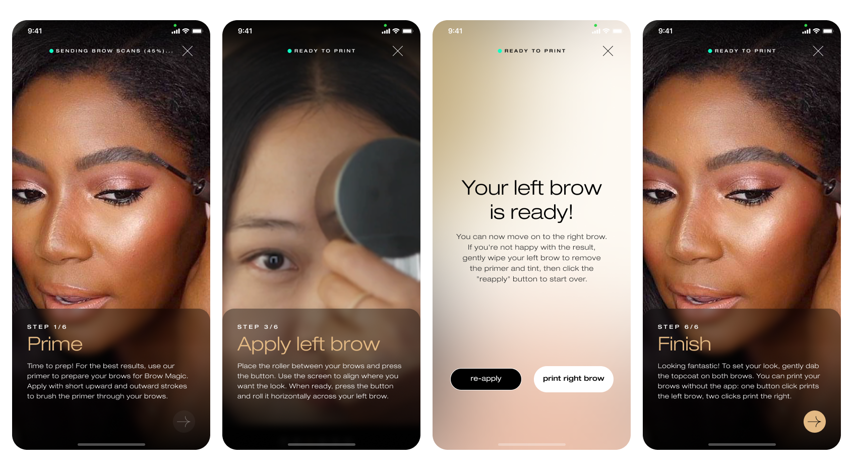
2. Tutorial rethink
Re-cut the sequence to keep total time under two minutes.
Re-wrote every microcopy cue so the camera, the device screen, and the app say the same thing.
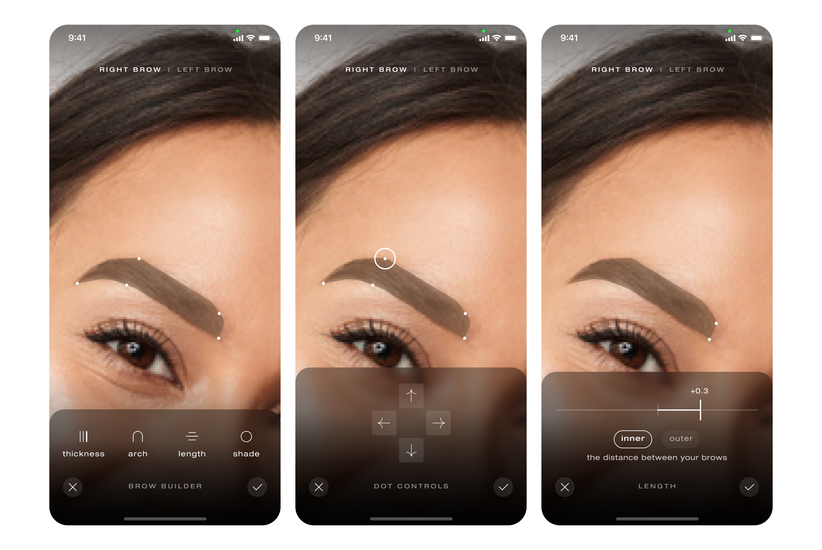
3. Brow builder uplift
Replaced a tiny length slider with draggable anchor points and arrow nudges (indirect manipulation). Users tap, nudge, and see millimetre‑level changes without covering the brow with a finger.
Filled the brow outline with the intended color instead of a wireframe. Realistic preview builds confidence before printing.
4. Accessibility as default
Verified color contrast and button sizes against WCAG AA.
Cut haptic feedback to prevent camera shake, kept a single success vibration for confirmation.
Parked for later: voice prompts over AI‑generated audio, to be reconsidered when budget permits.
5. Collaboration rhythm
Flexible weekly client touchpoints gather feedback and set priorities.
Engineering pushes updates while the design team refines flows and preps the next round of screens.
At the end of each week‑long sprint the team ships a fresh build with a concise changelog. No idle hours, no mystery changes.
Results
Scanning now runs on a single, cohesive visual system (glow ring, arrow cue, countdown). Early user tests show faster “face positioned correctly” confirmations and fewer restarts.
Tutorial now plays in under two minutes and mirrors printer prompts, reducing first-time confusion (qualitative user-test feedback only; quantitative metric still pending).
Brow editor lets users adjust shape to the millimetre with fewer mis-taps, based on internal QA sessions.
Visual language now holds together: consistent type scales, color tokens, and motion easing.
Takeaway
Luxury users judge speed, clarity, and craft in equal measure. By stripping the flows to essentials, aligning every feedback channel, and iterating nightly, the team shipped an experience that feels intentional instead of improvised. Future sprints can layer delight, but the solid backbone is in place.